Evaluating Time to Market for Grid and Chart-based Features
Building banking software exposes us to a lot of numbers. Balances, ratios, percentages, rates, they are littered throughout the systems that we create. The difference between data and knowledge lies in context. Shouting 42 from the rooftops is not very meaningful until you’ve read The Hitchhiker’s Guide to the Galaxy by Douglas Adams.
To discern knowledge, we need to unite data with context
It’s unsurprising that the majority of banking applications centre around massive grids exposing expansive arrays of digits. Showing scores of figures is the easiest option as we see our goal of presenting the right number. We forget that we should always show the correct values, regardless of representation. Discerning meaning from larger data sets is exceptionally challenging.
Not so recent events have got me contemplating about why we always settle for grids. It is regularly seen as the easy way out. Moving on from the human aspects of development, this week I focus on adoption of visualisations. I present my thoughts on our trepidation of utilising them over traditional tables.
Time After Time
It is a common misconception that graphs take significant time to develop over tabular views. Adoption of agile practices into our software development processes has granted us numerous gifts. To date, our focus on small, frequent releases has resulted in a large amount of new features being made available to our clients.
Once in the habit of producing new functionality regularly, we often impose pressure on ourselves to deliver increasingly more rapidly. This strain will influence our design decisions. However, the notion that charts are more challenging to construct is a fallacy.

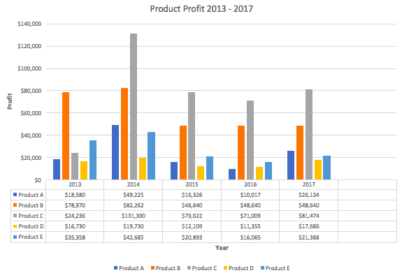
Working in banking, my clients exhibit a strong preference for Excel, and have a far better knowledge of the tool than I. It is an essential tool in their toolbox for conducting their daily responsibilities. The charting feature within Excel transforms tabular representations into a chart. The values underpinning graphs and grids are essentially tables.
By using one of the multitude of charting libraries available to us, we can transform these two-dimensional arrays into valuable visualisations using similar logic. My experiences over the last few years have shown that development time for charts and grids are on par. Our team regularly delivered chart and table based controls in a single development cycle. Furthermore, with definition of a common contract, the time to market has been further reduced. We just need to identify the use cases for which one is suitable over the other.
One is the Loneliest Number
With time no longer a factor, let us consider how to identify the best mechanism for presenting content. There is an inherent risk while building data heavy applications that we become monopolised by numerals. Accuracy is monumentally important. But to support our quest for correctness we must ensure the tools that we create promote a workflow that can allow users to achieve a quantifiable goal or benefit. Throwing a matrix of bamboozling digits together is easy for programmers, but can lead to information overload.
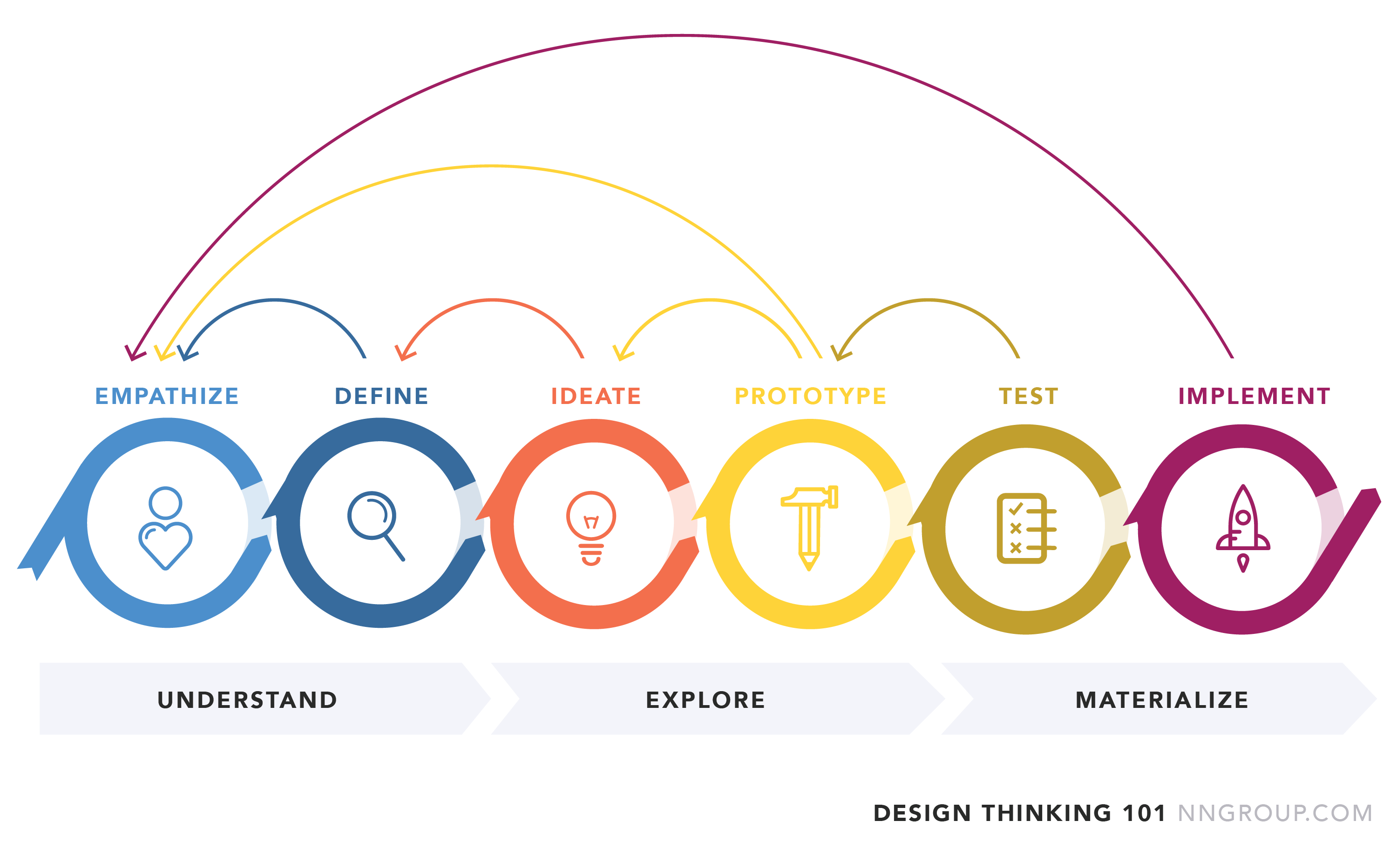
Endlessly searching through figures to find meaning takes its toll on people. To propose the best solution to our clients, we first need to identify the true problem. Design thinking is vital to identify the key goals of those using the system, and establish empathy with our users.

The key goal of the empathise and design stages is to develop an understanding of the current challenges that our system should be striving to address. This is achieved by observing people and asking questions. What are users actually trying to achieve? What is that value actually for? What decisions and subsequent actions will be triggered from the knowledge invoked by this number? If it’s just a single integer, then show the value with labelling for clarity. If you need a few more, consider using heatmapping or highlighting techniques to show users where to look. The domain is critical to allow benefit to be discerned from the system.
Draw the Line
Once we have developed an understanding of the key system goals, that’s when the fun really begins, at least for me. Brainstorming and sketching out ideas may initially appear time consuming. However this is a misconception that can be addressed using low fidelity options such as pen and paper, or even Excel!
Often we start with utilising simple visualisations such as bar and line charts. Such mechanisms are useful for identifying peaks and trending across our statistics. Once we start charting there is a danger that we only use these techniques, regardless of the observed objectives.
Researching alternatives will help us propose suitable solutions for our data sets. Seeking out innovative ideas will help you realise that information is beautiful. There are a few rules of thumb to help you on this journey. Sankey diagrams are good for showing usage flows and their composition. Directed graphs are fantastic at visualising relationships and hierarchies between key components.
As technologists, we strive to continuously improve our processes to produce valuable, scalable, maintainable software. Nevertheless, the features we build should be fostering continuous improvement to our client’s processes. Let’s propose the right control to solve the problem, rather than deceiving with a deluge of digits.
Thanks for reading!


One thought on “A Fine Blue Line”
Comments are closed.